Millarto, UX/UI design and digital identity renewal
Project Context
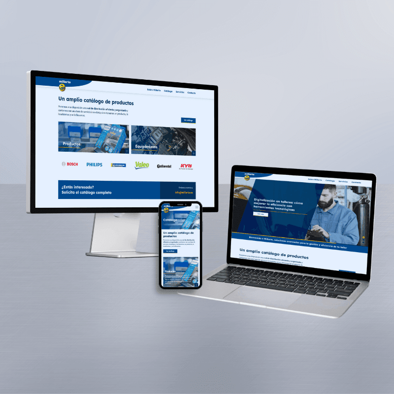
After defining Millarto's overall digital strategy, the next step was to completely redesign its user experience and visual interface. The old website—based on Flash, lacking a mobile version, and with an outdated structure—did not reflect the quality or true specialization of the company, which is dedicated to the distribution of automotive spare parts.
The goal of the UX/UI process was to modernize the website, organize the information, and build a professional and coherent digital image, adapted to current standards and the needs of the automotive sector.
1. UX Research and Architecture
The work began with an analysis phase focused on:
Initial state assessment
- Confusing content hierarchy
- Pages lacking clear structure
- Poorly accessible technical information
- Nonexistent mobile experience
- Limited and unintuitive navigation
Redefining the information architecture
Based on the findings, a new UX structure was built, focused on:
- Organizing the spare parts and services catalog
- Facilitating quick access to the main categories
- Enhancing navigation through modern patterns
- Clarifying the value proposition from the first impression
The result was a clean, hierarchical website map designed for industry professionals.
2. UI Design: A New Digital Image for Millarto
With the architecture defined, the next step was to design a renewed and consistent visual interface.
To achieve this, we worked on five pillars:
1. Updated Visual System
The brand needed a more modern, technical, and robust aesthetic.
A design system was created based on:
- Blue and neutral tones associated with the automotive sector
- More legible and professional typography
- Greater presence of visual elements linked to workshops and spare parts
- Clean structures that facilitate quick reading
2. Image Selection and Processing
The old photograph was replaced with images that are:
- More modern and of higher quality
- Related to machining, workshops, and real processes
- Consistent with the brand's industrial aesthetic
3. UI Components Adapted to the Catalog
Specific modules and cards were designed for:
- Presenting spare parts categories
- Describing services
- Highlighting catalog items
- Quick access and clear CTAs
All within a scalable modular system.
4. Mobile-First Experience
The new interface guarantees:
- Optimal mobile performance
- Simplified navigation
- Clear visual hierarchies
- Fast and intuitive interactions
This represents a huge leap forward compared to the original site.
5. Social Media Consistency
The new visual system also served as the foundation for social media, ensuring a consistent digital identity across all platforms.
3. Prototyping and Validation
Once the design was finalized, interactive prototypes were developed to:
- Validate navigation flows
- Check the clarity of the information
- Verify how the interface behaved on a real screen
- Review responsiveness on different devices
This process allowed for the refinement of micro-interactions, spacing, hierarchies, and visual optimizations.
Result
Millarto's new UX/UI design delivers:
- A modern and clear experience
- A professional and consistent image
- Intuitive navigation on both desktop and mobile
- An easy-to-navigate product catalog
- An updated visual identity aligned with social media and digital strategy
- Greater clarity in commercial and technical communication
This redesign lays the visual groundwork for the brand's digital growth and paves the way for subsequent web development, optimization, and SEO.
Do you like our projects? Contact us now
projects@asteastudio.esRelated projects
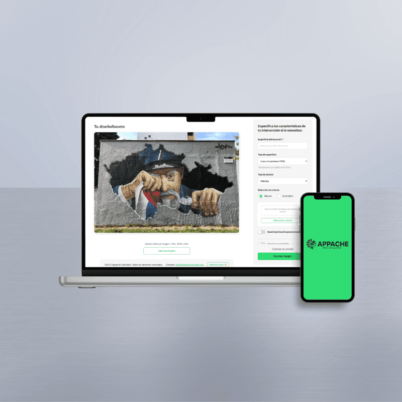
Appache, AI-Powered Paint Calculator
Appache is a custom digital tool developed in Svelte that uses AI and image analysis to accurately calculate paint usage based on real project conditions.
Rao & Xera, WordPress website development based on provided design
WordPress website development for Rao and Xera: two modern landing pages created from a provided design, with ACF for easy and flexible management.


Interested?
Contact us now
projects@asteastudio.com
